User Interface Ideas

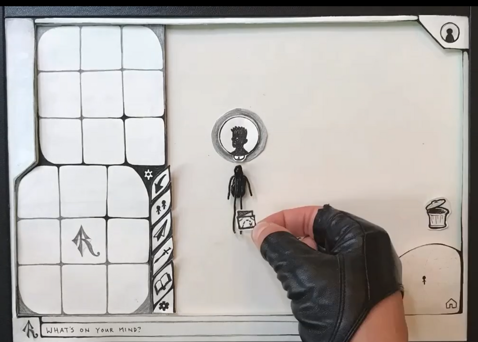
Should we have a “game mode” and a “builder mode”? What does private messaging look like? What does your character's inventory look like? Is inventory separate from uploading a photo?
We're discussing the new user interface and we have a lot of ideas!
Rey's UI sketch is a “whole picture view” of things, trying to integrate many of the ideas we've had–a personal profile, a minimap, a thought bar, uploading photos, emojis, and then panels on the left including contact list, inventory, message inbox, builder library, and settings:
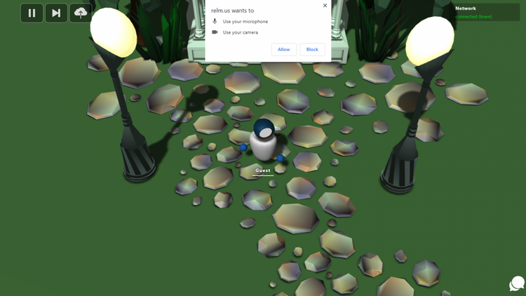
My (Duane's) prototype focuses more on the “content creation” side, using a horizontal expanding panel, or accordion. It includes writing, expressing emotion as emojis, choosing existing photos or uploading new photos, and drawing:
If you'd like to join in the discussion, visit us on Discord. We love meeting other creative minds!


